Think about the brands you recognize instantly without reading the name. They pull it off because they always use the same colors, the same fonts, and the same style. That's visual identity, and it isn't just for big brands.
What makes up your visual identity
- Logo and its versions (color, white, black).
- Color palette, primary and secondary.
- Fonts for headlines and body text.
- Photo and design style: modern, elegant, fun, minimalist…
Why it helps you sell
- People recognize you faster when your posts show up.
- It builds trust: a well-organized brand looks like a serious business.
- It sets you apart from competitors who post with no style at all.
A customer who sees 10 posts in 10 different styles doesn't recognize a brand: they see 10 random ads.
The most common mistake
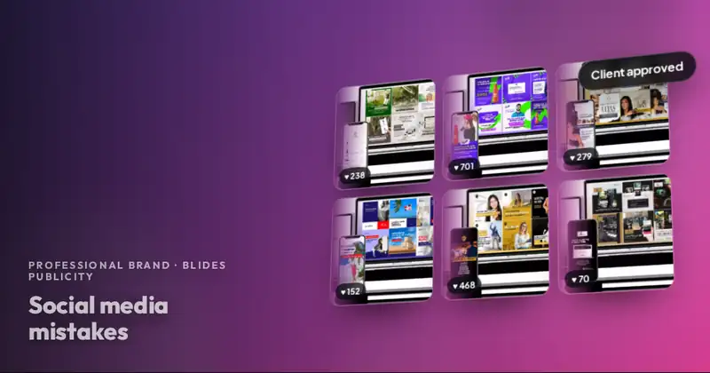
Working with a different designer for each piece. This month's flyer looks nothing like last month's, and the video uses different colors. Over time, your brand gets diluted.
How we keep it consistent at Blides Publicity
With Professional Brand we define your visual style at the start and apply it to every design: flyers, videos, business cards, and posts. Since designs are unlimited, you don't have to look for someone else when you need something new, and everything keeps the same style.
Want your brand to look professional every month?
Unlimited designs, a community manager and approval of everything before it goes live. $350 a month; new clients, $250.
Frequently asked questions
What if I already have a logo?
We use it and build your visual style around it. If needed, we suggest improvements.
How long does it take to define the visual style?
It's defined together with you at the start of the service, before we prepare the month's content.